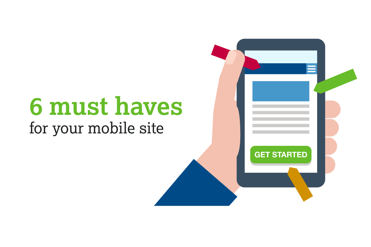
6 Ways Your Website Can Create a Great Experience for Mobile Users
Updated
If you have a website, chances are very good that more and more of your visitors are viewing your site from a mobile device, and are expecting a user experience (UX) that reflects a mobile-first mindset.
According to Pew Research, 95% of U.S. adults own a mobile phone, and global mobile data usage is expected to quadruple by 2025. As mobile use continues to grow, having a responsive, mobile-optimized site is crucial to increasing website traffic and satisfying your customers. Here’s what your website needs to give your mobile audience an excellent user experience.
1. A mobile-optimized nav bar.
On a mobile device, screen space is limited, so the seven-item navigation bar that looks so nice across the top of your website on a desktop won’t translate well to mobile. People still need to know how to find what they’re looking for, though, so don’t eliminate the nav bar altogether or hide all your menu items in a hamburger menu. UX research has shown that the best option for mobile is a combination of the two, showing the two most-used navigation links and tucking the rest into a hamburger menu or a “more” button with a dropdown.
2. Easily clickable buttons and callouts.
Mobile users often interact with a website using a single finger or thumb, so good mobile UX dictates that anything clickable on a website should be located toward the center of the screen for ease-of-access, and should be large enough to prevent accidental clicks.
3. Smaller file sizes.
Huge files can bog down a website’s performance, causing slow load times that drive your mobile users away. Make sure you minimize the size of your files and images before you upload them to your website. Anything extra (plugins, feeds, files, etc.) can slow a site down, so make sure all the elements on your site are relevant and necessary on the page.
4. Click-to-call and link to map.
Mobile users don’t want to take the time to make note of a phone number or address, open the phone or map and type in the info. Phone numbers, addresses, and email addresses need to generate a call, directions, or a new email message with a single click. Your phone number should be a clickable link, and your address should open in a map app.
5. A mobile-friendly layout.
Mobile screens are smaller, obviously, so the layout of your mobile site should be easy to see and use on a mobile device. This includes a more vertical scrolling layout with clean, easy to read typography. When making any changes to your web pages, make sure you test them on mobile devices to ensure a good mobile experience.
6. Simplified forms.
Actually, simplifying your forms is a good idea for your desktop site as well—the more time your forms take to fill out, the greater the chance they have of being abandoned. Eliminate any form fields you don’t really need and ask only for key information.