Youth Recovery CT
Filling in a critical gap in Connecticut’s recovery services, Youth Recovery CT provides peer support meetings and social events specifically for teens and young adults.
- Excellence Award: Logo Design
- CADC Silver: Website Design
Branding
A new logo was designed to connect with the organization’s young adult audience. The central lotus is a symbol of personal growth and transformation, while its multi-colored, overlapping petals evoke both peer support and diversity. Bold, symmetrical lines help the logo feel strong and balanced.

Alternate Logo Concepts
We presented a variety of logo directions to visually represent the Youth Recovery CT brand. Some options put the idea of rebirth front and center, like those with the phoenix and the leaf. More abstract concepts used bursts of light and spirals to suggest motion, energy, and positivity. We also explored logo designs with the state outline to highlight the service area.
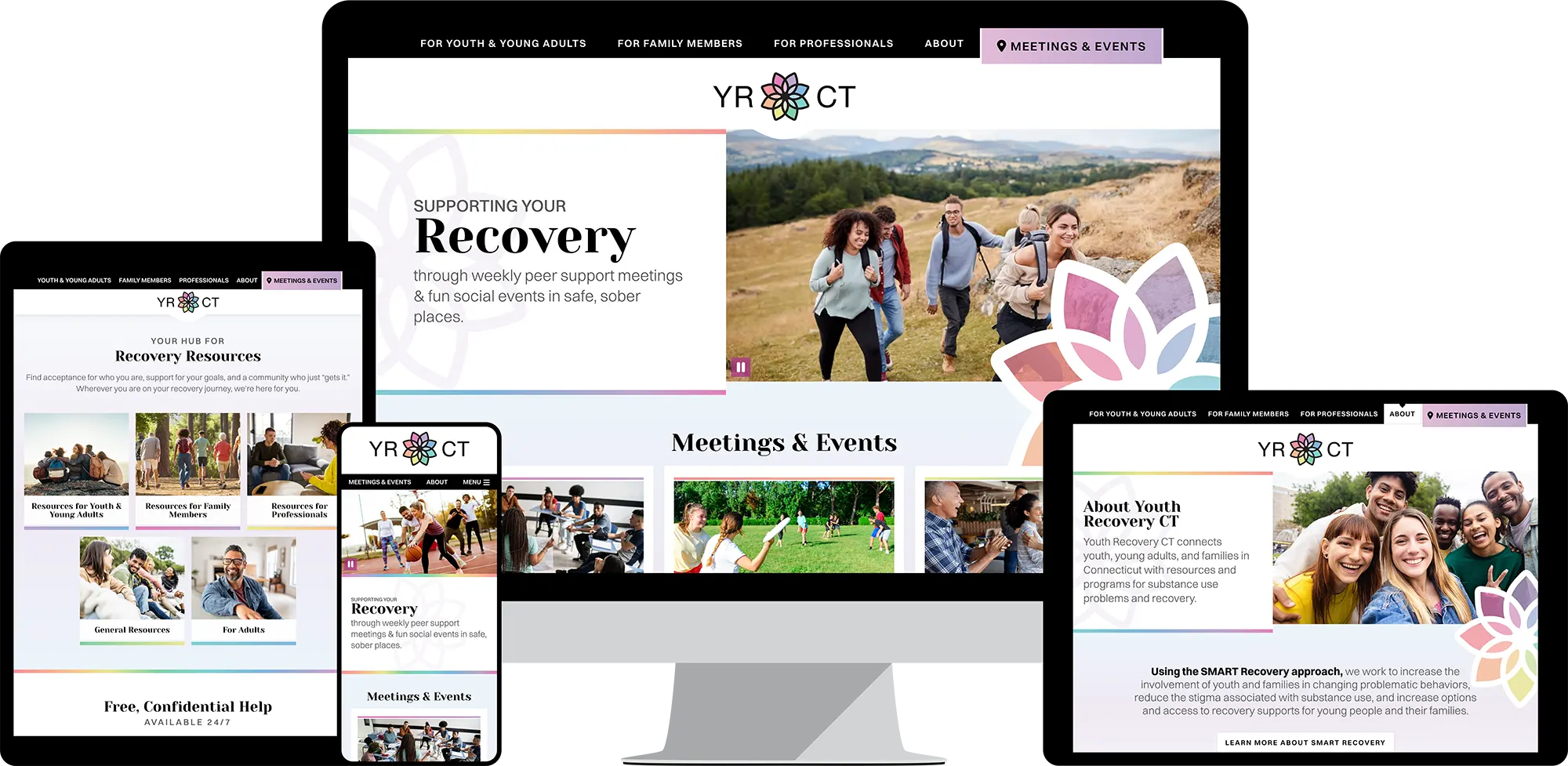
Website www.youthrecoveryct.org
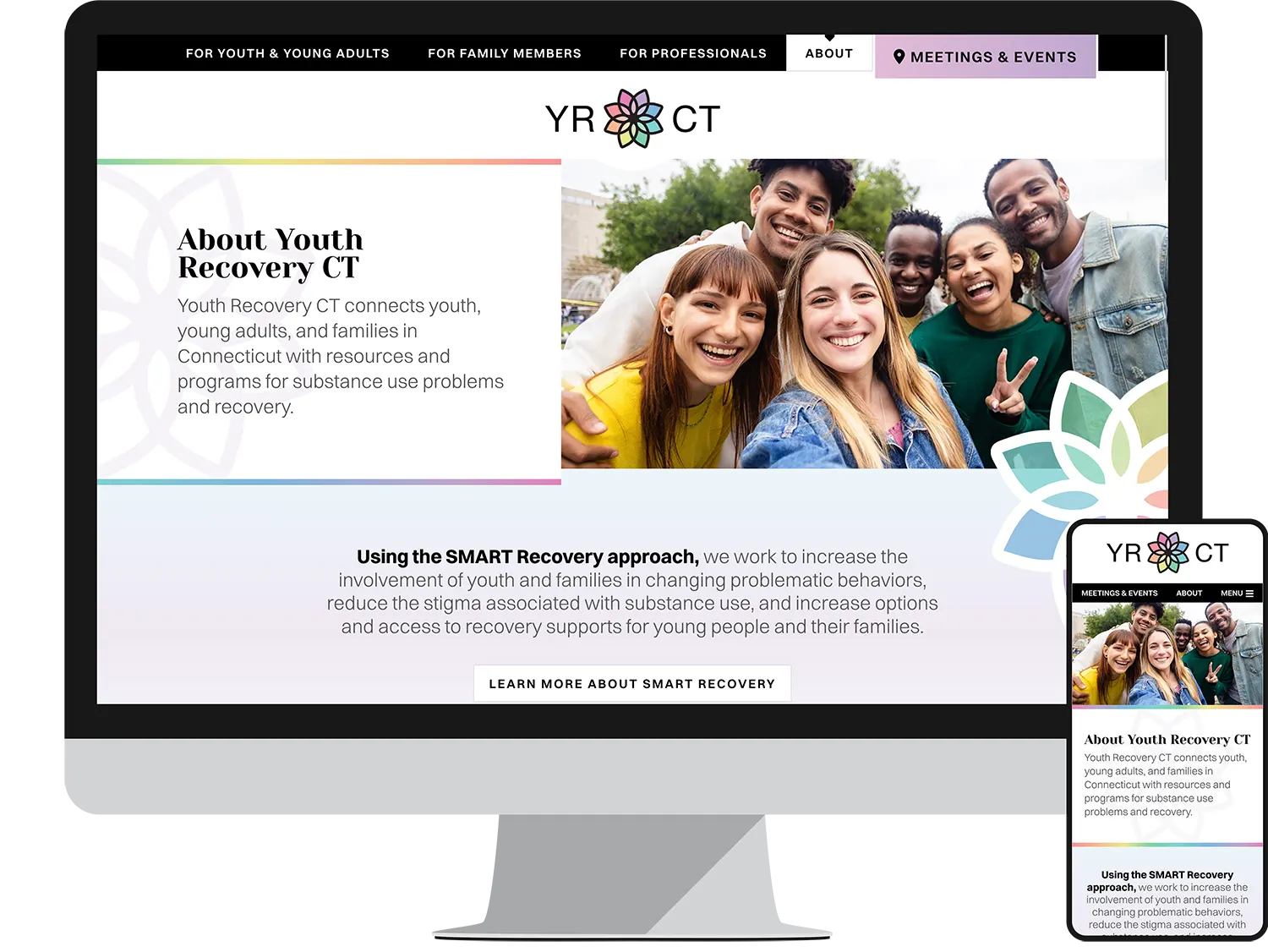
To design a vibrant and inviting website, our team drew inspiration from the new logo’s color palette. A clean, audience-based navigation allows the site to reach multiple markets, while helping users quickly find the meetings and information they need.
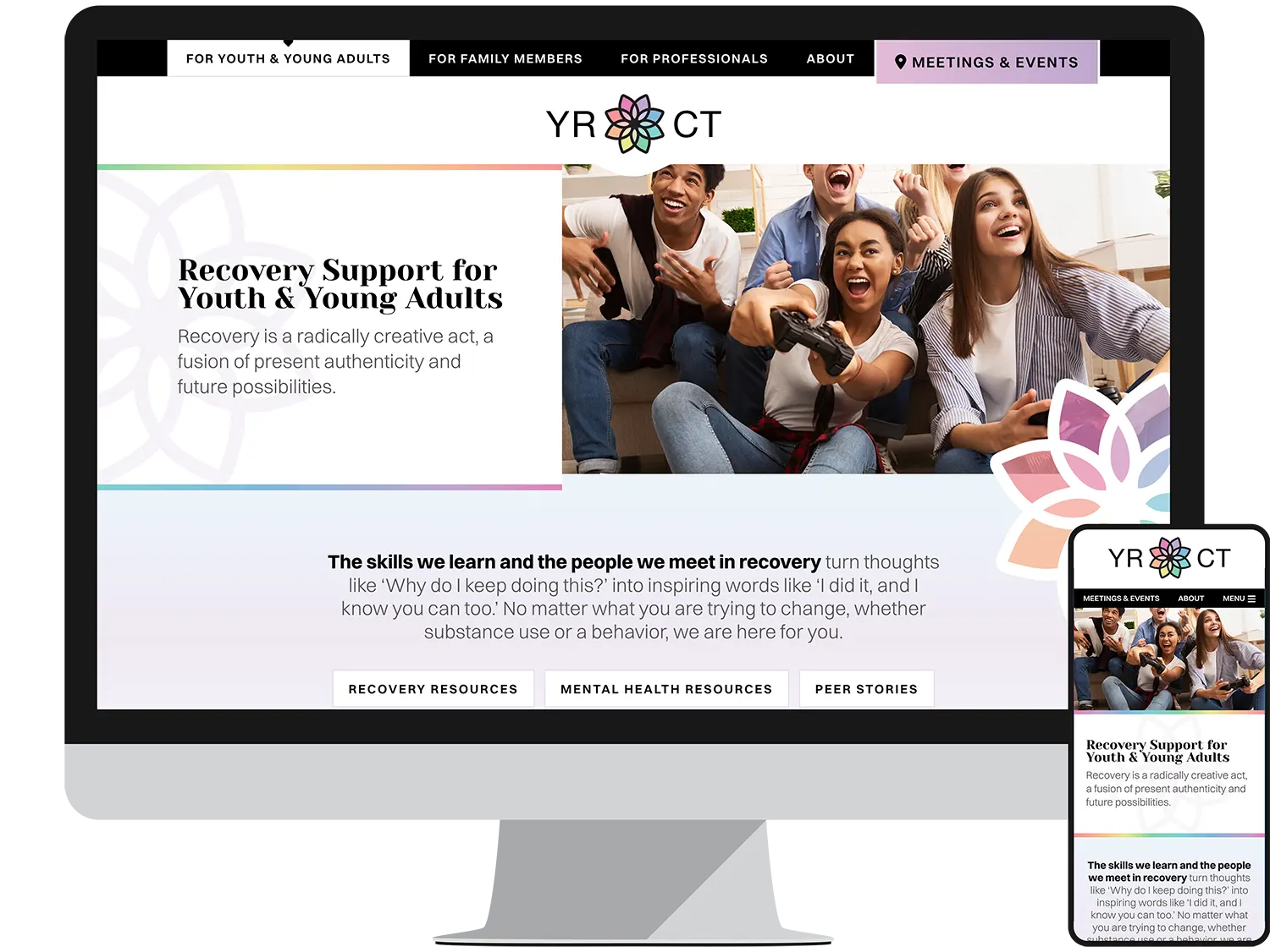
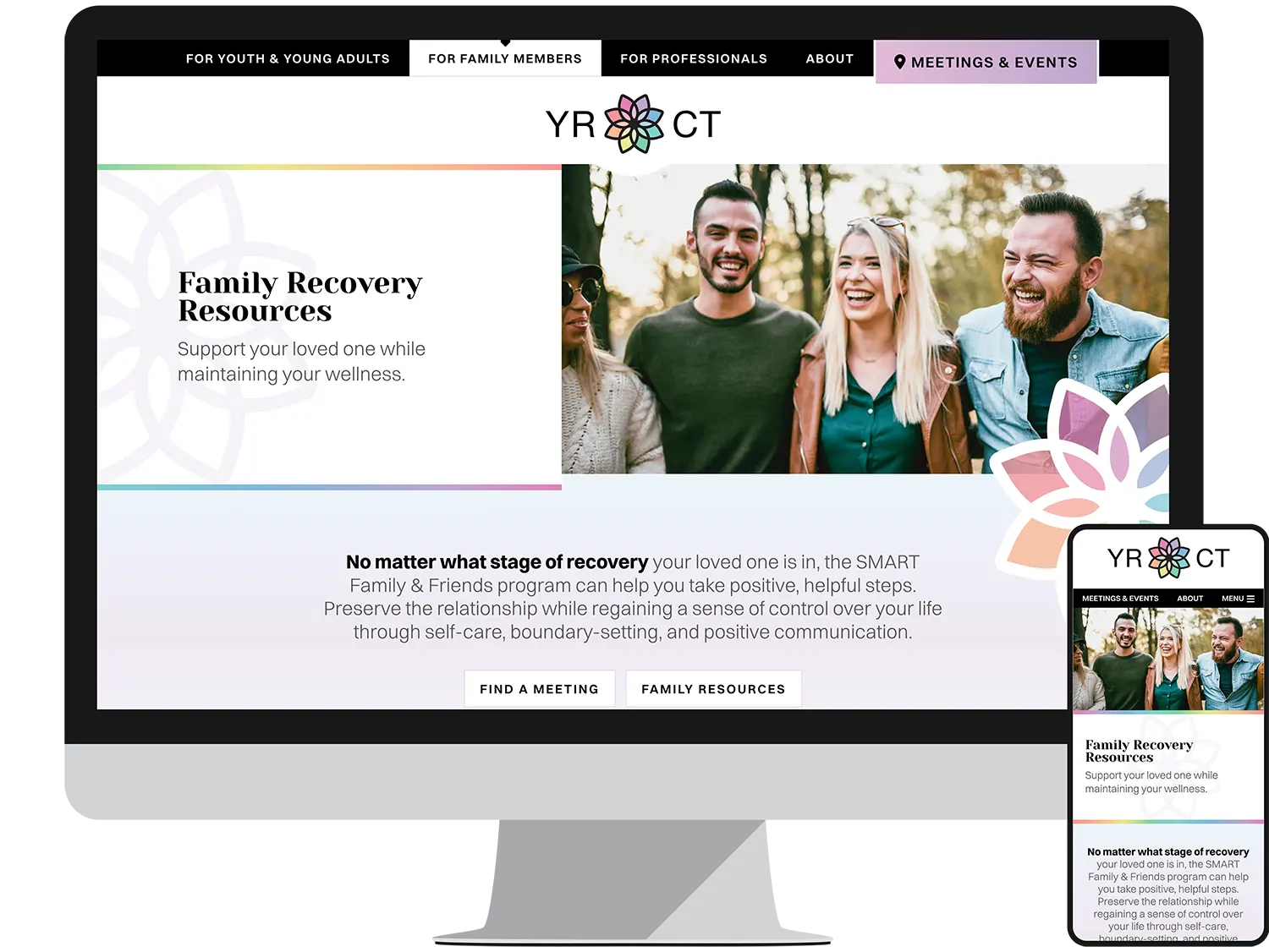
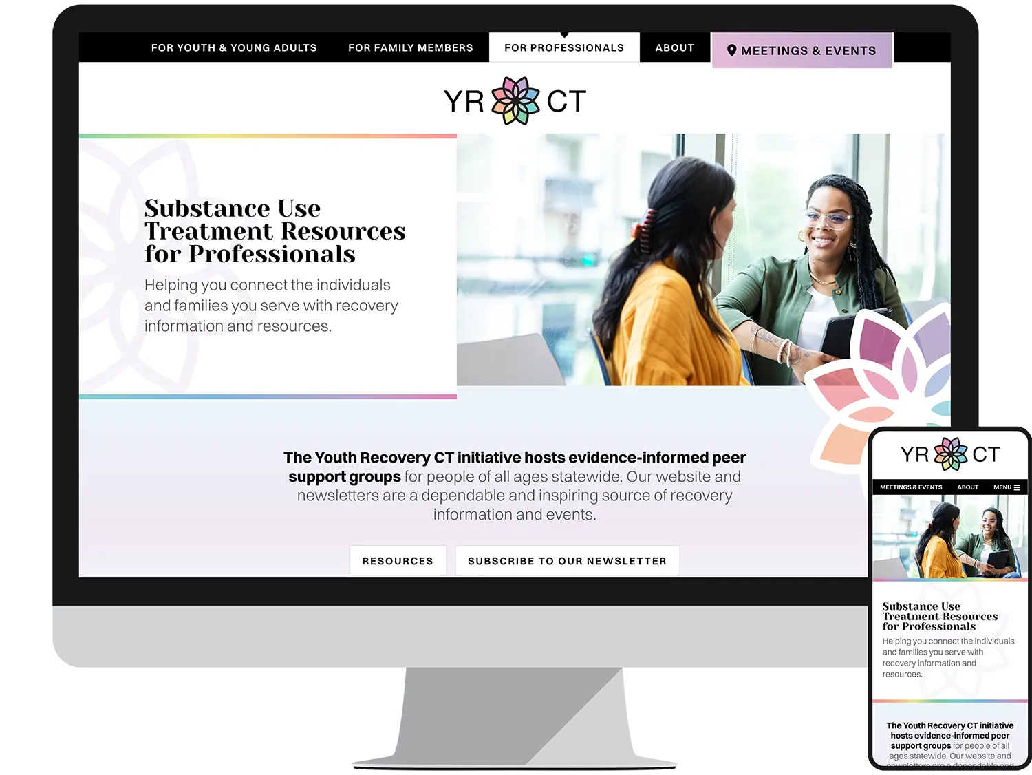
Landing Pages
A custom landing page was designed for each of the target audiences, allowing important resources, statistics, and next steps to be clearly identified. Each audience landing page leads users into the Meetings & Events section, with the calendar pre-filtered by age range.
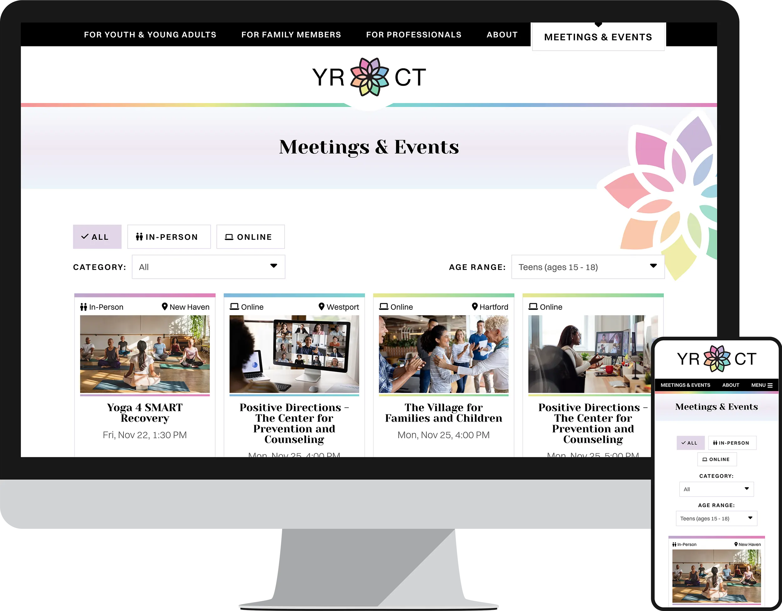
Meetings
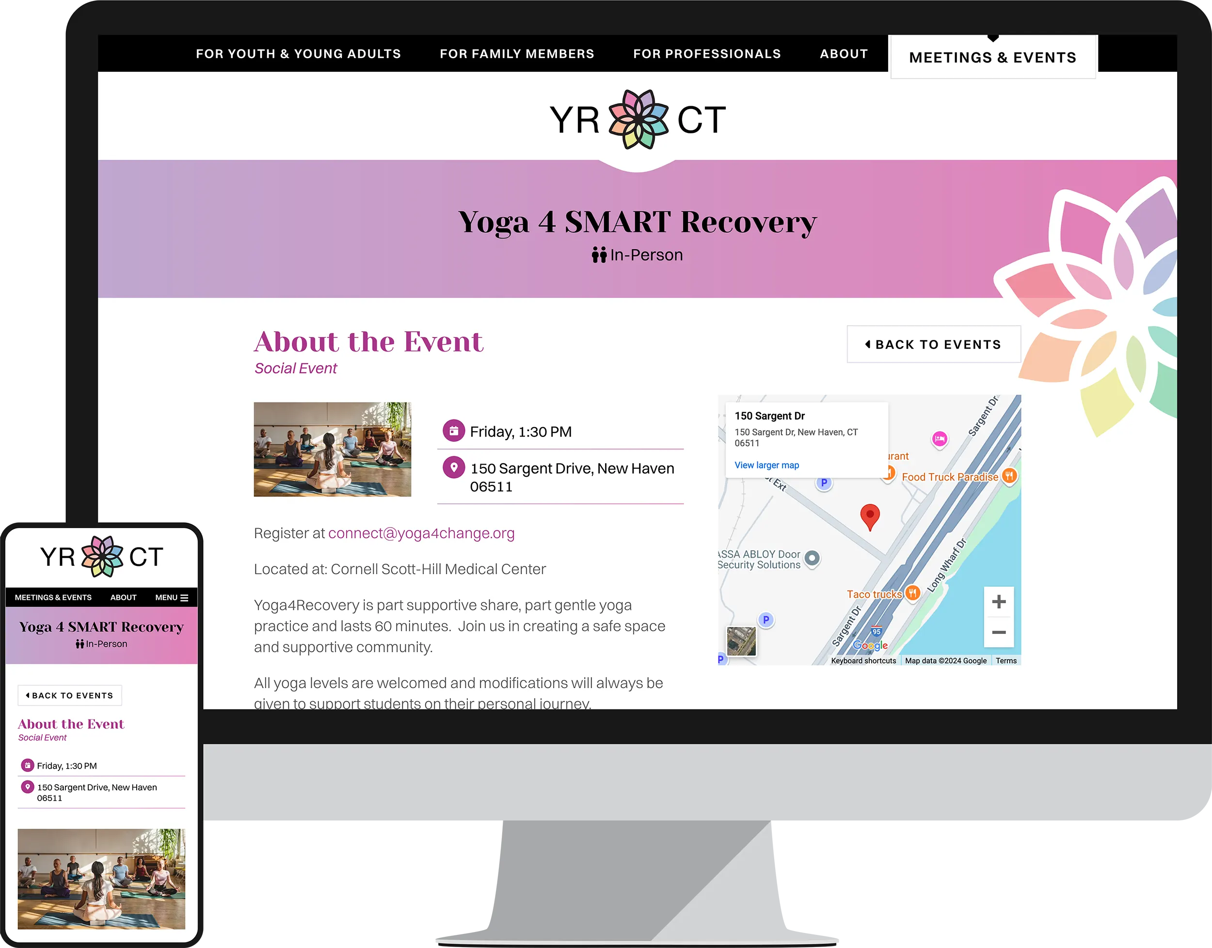
Helping users find recovery meetings and social events is crucial for Youth Recovery CT, so we designed a streamlined, easy-to-use section of the website for their calendar. Users can filter the upcoming events to find one that matches their preferences. Each event page provides contact information, directions, registration links, and similar events.