Mobile Websites 101: Key Mobile Design Terms and What They Mean

At Web Solutions, every new site we build is optimized for mobile, and we've updated many of our older sites to make them mobile-friendly. We’ve also written several blog posts about how important mobile optimization is for modern websites, but there's still a lot of confusion out there about what it means to have a mobile website, how they're built, and what technology and design approach they use. Here are some key mobile-related terms, and what they mean for you.
Mobile-Friendly
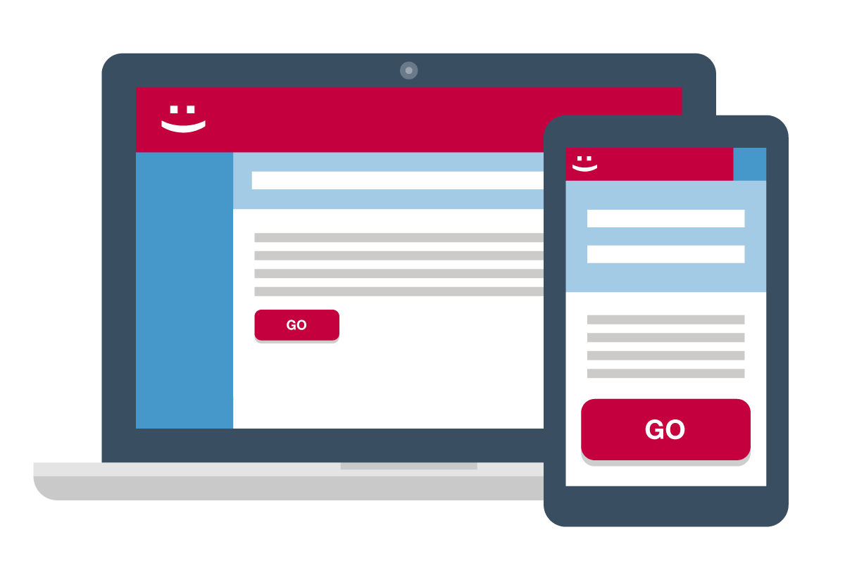
A mobile-friendly site is basically any site that has been optimized to make it easy to use on mobile devices. A mobile-friendly site will have features such as larger, touchscreen-friendly buttons, optimized images, click-to-call phone numbers, and content that’s formatted in a way that makes it easier to read on a small screen.
Bottom line: Mobile-friendly is a generic term to describe a website that has been optimized for display on mobile devices like iPhones, Android phones, and tablets.

M-Dot
When the mobile revolution began, many websites opted to create a separate mobile site with a different URL starting with the “m-dot” prefix (e.g., m.domain.com, or sometimes domain.com/mobile). When a mobile user visited the main site, they would be redirected to the m-dot site, which usually offered fewer pages, a simple navigation, and less content. The upside of m-dot sites was the ability to quickly create a fully mobile website, highlighting things mobile users might be looking for, such as phone numbers and directions. The downside: Maintaining and managing two different websites required extra resources and made link-sharing problematic. And users looking for content from the desktop version might find it missing from the m-dot site.
Bottom line: Google’s mobile-first index initiative, which will base search results on the mobile versions of websites, may penalize companies that have stripped-down m-dot sites.
Mobile-First
Mobile-first isn't a type of mobile site, it's a state of mind that guides how a site is designed and built. Traditionally, a website was designed with the desktop user in mind, then a mobile version was created by simplifying and stripping down elements from the desktop version. With mobile-first design, the mobile version of a website is designed first, and enhancements are made to the desktop version if needed.
Bottom line: Mobile-first is a design philosophy that aims to allow mobile users to fully and easily experience all the features of a website.
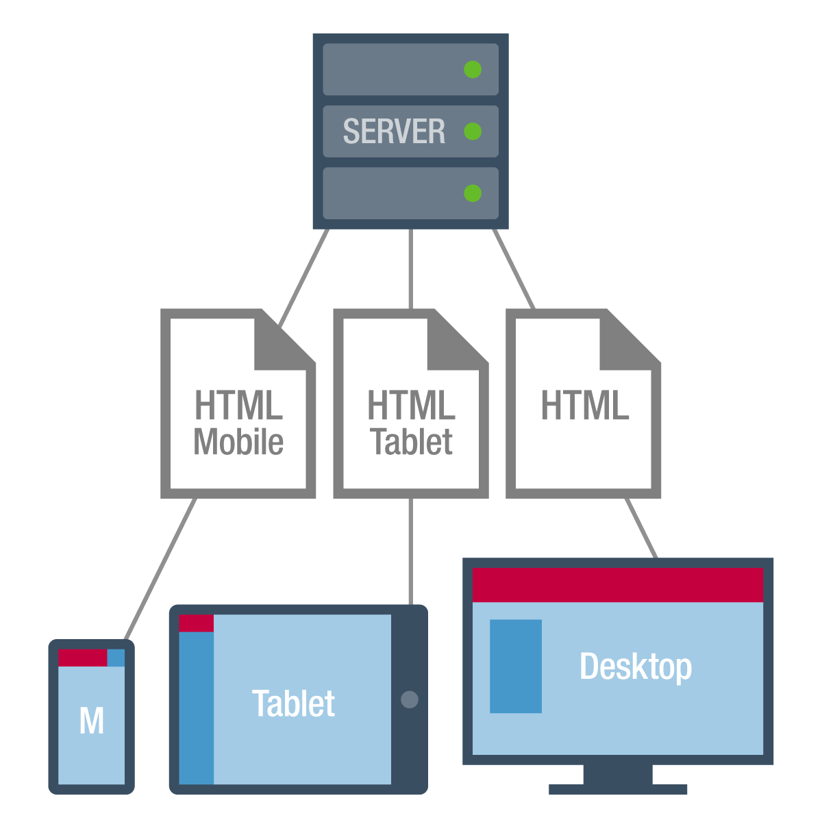
Adaptive
An adaptive website uses unique page layouts for different devices. When someone accesses the website, the server detects the type of device (typically mobile or desktop) and loads the appropriately configured page layout. Adaptive design is sometimes used to make older sites more mobile-friendly without starting from scratch, and has the benefit of giving the site developer total control over how the site will appear on different devices, which is useful for the more complex layouts required by some ecommerce sites.
Bottom line: While still a viable option for retrofits, most new sites do not use adaptive design.
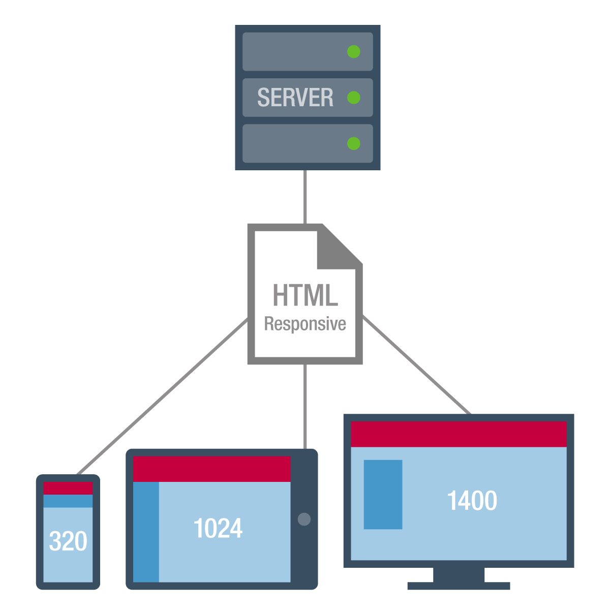
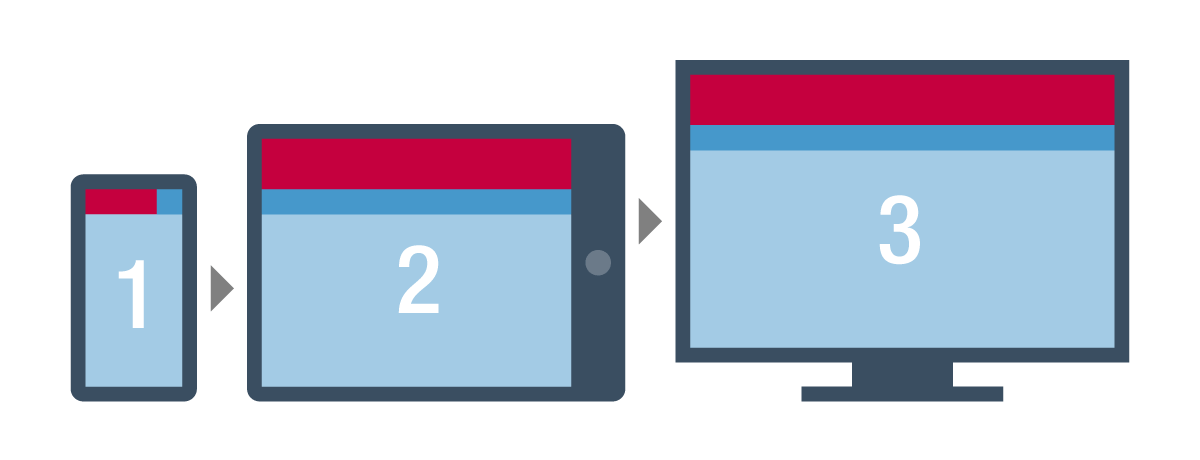
Responsive
The current standard in mobile optimization, responsive design enables a website to adjust its styling based on the screen size of the device being used. It requires no separate page layouts for different device sizes, and it gives every user an experience that is customized to the device they’re on.
Bottom line: Responsive design is the current standard for mobile-optimized websites, and it gives every user an experience that is customized to the screen size they’re using.
As mentioned above, Google's mobile-first index, which is set to roll out next year, will be a game-changer for any website that has not jumped on the mobile bandwagon. More than half of web searches are now made on mobile devices and Google wants its search results to reflect the experience of the majority of its users, so it will basically be crawling the entire internet from the point of view of a mobile user, and penalizing content that is not mobile-friendly.
Not sure if your site is mobile-ready? Take Google’s Mobile Friendly Test to see if your website meets their mobile requirements, or take it for a test drive yourself from your mobile device.