Why You Need a Mobile-Friendly Site. Now.

There are now more mobile devices than desktops accessing the internet. That means if your website isn’t mobile-friendly, you’re already at a serious disadvantage, and it will only get worse. Here are three reasons you need a mobile-friendly site.
1. To Provide a Better Experience for Mobile Users
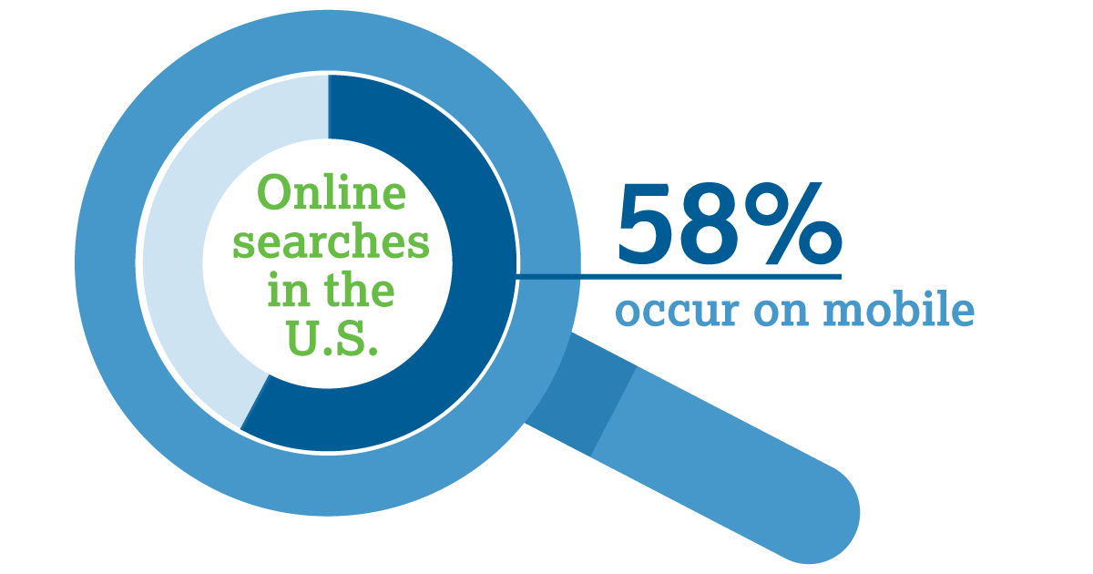
More people are mobile than ever before, and the trend shows no sign of slowing. According to a report by Hitwise, 58% of online searches in the U.S. now occur on mobile devices. Searches in the categories of food and beverage, health, sports, news, lifestyle, and automotive are even more mobile-heavy, with searches in those categories ranging from 62%-72% on mobile.
When those mobile users perform a search, they expect to see sites that are optimized to make mobile viewing easy and intuitive, including click-to-call numbers, integration with driving directions, and no squinting and pinching.
If your site can’t be easily viewed and navigated on a mobile device, those users are likely to go elsewhere. According to a study by Google, 75% of people prefer a mobile-friendly site, and 48% are frustrated and annoyed when they encounter sites not designed with mobile users in mind. And that was in 2012, when mobile was less prevalent. Today, expectations for a good mobile experience are even higher. A recent study by BrightLocal found that after conducting an online search, 61% of users are more likely to contact a local business with a mobile site.
2. To Capitalize on the Growth of Mobile Shopping
Mobile commerce now makes up 34% of all ecommerce transactions worldwide, and is expected to grow to 50% of all U.S. ecommerce by 2017.
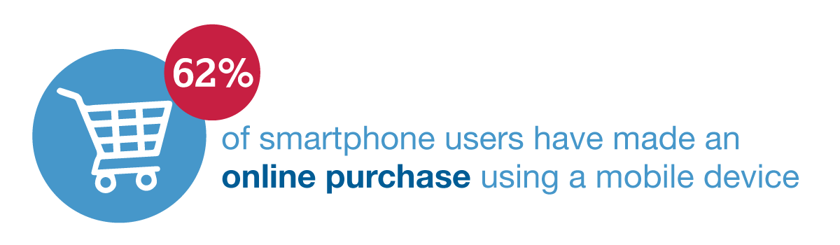
Of people who own a smartphone, 62% have used it to make an online purchase within the last six months. In last year’s holiday shopping season, 30% of online purchases were made on a smartphone, and a recent study by Fluent found that 40% of U.S. consumers plan to make at least one purchase this holiday season on a mobile device.
All these numbers mean that when people shop online, they’re increasingly doing so with their phones, so if you have an ecommerce site that isn’t optimized for mobile users, you could be leaving a lot of money on the table.
3. To Be in Google’s Good Graces
Google has been shifting toward mobile for years, making several search algorithm updates to give mobile friendly websites better positions on Search Engine Results Pages (SERPs). The next mobile-friendly change will be a separate mobile search index, which will become the primary index Google uses to respond to queries. The desktop index will be separate, and won’t be as up to date.
While it’s still unclear how the new index will affect queries, one thing is for sure: To have the best chance of ranking high on searches, your website needs to be mobile-friendly.
Not sure if your site is mobile-ready? Take Google’s Mobile Friendly Test to see if your website meets their mobile requirements, or take it for a test drive yourself from your mobile device.